Typography tips for websites matter more than most creative entrepreneurs realize. The fonts you choose, how you size them, and how they sit on the page can make the difference between a site that feels polished and trustworthy — and one that feels a little off, even if a visitor can’t explain why.
If you’re a wellness coach, content creator, or creative entrepreneur building your first website, this guide is for you. You don’t need a design degree. You just need to understand a handful of core principles — and once you do, you’ll make better font decisions every time.

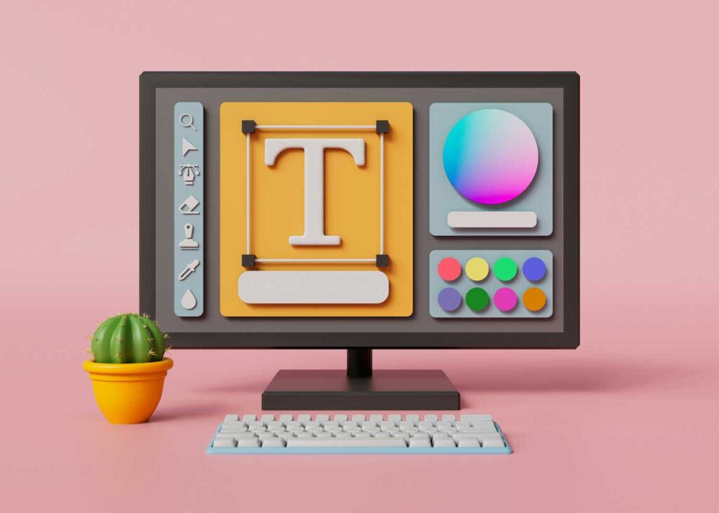
Why Web Typography Matters
Typography shapes perception before a single word is read. The fonts you choose communicate your brand personality instantly — whether you want to appear warm and approachable, clean and professional, or bold and distinctive.
More practically: poor typography makes your content harder to read, and harder to read means higher bounce rates. Readers click away. Great typography keeps people on your page, builds trust, and makes your content genuinely enjoyable to consume.
For anyone building a brand in the wellness, coaching, or creative space — where trust and warmth are everything — getting your typography right is one of the highest-return design decisions you can make.
The Key Elements of Web Typography
1. Font Selection
Your font choice is your brand’s first visual statement. There are three main categories to know:
- Serif fonts — fonts with small decorative strokes at the ends of letters (like Georgia or Playfair Display). They feel classic, authoritative, and editorial. Great for wellness and lifestyle brands that want warmth with gravitas.
- Sans-serif fonts — clean, modern fonts without those strokes (like Inter, Lato, or Poppins). Versatile, highly readable on screens, and the go-to choice for most contemporary creative brands.
- Display or decorative fonts — expressive fonts meant for headlines only. They add personality and visual punch, but should be used sparingly — a heading, a pull quote, nothing more.
The golden rule: use a maximum of two to three fonts. One for headings, one for body text, and optionally one accent font for special elements. More than that and your site starts to feel chaotic.
💡 Bowerist tip: For wellness coaches and creative brands, a clean sans-serif body font paired with a warmer serif or display font for headings is a classic combination that reads as both professional and approachable. Try Playfair Display headlines + Lato body, or DM Serif Display + DM Sans for a more modern feel.
2. Font Size and Hierarchy
Think of your website like a well-organized article — there’s a clear headline, subheadings that guide the reader, and body text that’s comfortable to read. Your font sizes create this visual hierarchy.
A good baseline:
- Body text: 16px minimum for comfortable reading on desktop — many designers now use 18px
- H1 headings: roughly 2–3× your body size
- H2 subheadings: roughly 1.5–2× your body size
- Make the size differences meaningful — a heading that’s only slightly larger than body text doesn’t signal importance the way it should
💡 Bowerist tip: When in doubt, go bigger on your headings. The jump between H1 and body text should feel almost dramatic — that’s usually about right. If the size difference looks exaggerated in Canva or your WordPress editor, it’s probably working.
3. Line Height and Letter Spacing
Two settings most beginners overlook — and both make a significant difference to readability.
Line height (the vertical space between lines of text) should be roughly 1.5× your font size for body text. Too tight and text feels cramped; too loose and it feels disconnected.
Letter spacing (the space between individual characters) is usually best left at default for body text. For headings, slight increases in letter spacing can add elegance and airiness — particularly effective for wellness and premium brand aesthetics.
4. Color Contrast
Your text must be clearly readable against its background. High contrast — dark text on a light background, or vice versa — is non-negotiable. Low contrast text is harder to read and signals a lack of care to visitors. ➡️ See our Color Contrast Checker to see how your color palette rates.
A simple test: if you squint at your page and struggle to read the text, the contrast isn’t high enough. Pure black (#000000) on white can feel harsh; most designers use near-black (#1a1a1a or #2d2d2d) on white for a softer but still highly readable result.
5. Whitespace
Whitespace — the empty space around and between text — is not wasted space. It’s breathing room. It makes your content easier to read, your design feel more premium, and draws attention to what matters.
Look at any high-end wellness brand, luxury skincare site, or premium editorial publication. They all use generous whitespace. It signals confidence and quality.
💡 Bowerist tip: If your website feels cluttered or overwhelming, adding more whitespace is almost always the fix. Increase padding around text blocks, add more space between sections, and let your content breathe. Less is more — and more whitespace reads as more premium.
Reliable Font Pairings for Creative and Wellness Brands
If you’re building your site in WordPress or designing in Canva, here are some tried-and-tested pairings that work beautifully for wellness, coaching, and creative brands:
- Playfair Display + Lato — editorial, warm, great for wellness and lifestyle brands (see how Peachy Zen applies a warm, readable aesthetic for journaling and self-care content)
- Cormorant Garamond + Raleway — elegant, slightly luxe, brilliant for premium brands
- DM Serif Display + DM Sans — modern, clean, a designer favourite
- Libre Baskerville + Source Sans Pro — trustworthy, readable, professional
All of these are available free in Google Fonts and in Canva’s font library.
Make Sure It Works on Mobile
Most of your website visitors are on a phone. This means your typography needs to work at smaller screen sizes — not just look great on a desktop.
Check your site on mobile regularly. Headings that look elegant at desktop size can become overwhelming on a small screen. Most good WordPress themes handle responsive sizing automatically, but always test it yourself before you publish.
Conclusion
Typography isn’t about picking a pretty font — it’s about building a reading experience that feels on-brand, professional, and easy to consume. Get your font pairing right, establish a clear hierarchy, give your content breathing room, and make sure it reads clearly on every screen size.
For wellness coaches and creative entrepreneurs building their first website, good typography is one of the simplest ways to instantly elevate how your brand is perceived — no design degree required.
Ready to go deeper? Explore the Bowerist blog for more practical design and branding guides for creative entrepreneurs.