Walk into the wrong gallery and you feel it immediately: too much on the walls, poor lighting, everything competing for your attention. You back out in ninety seconds.
Walk into the right one and something different happens. The space opens up. Your eye knows exactly where to go. You slow down. You see.
No one handed you instructions. The design of the space did the work.
That’s exactly what your website should do — and New York’s best galleries have been quietly teaching this lesson for decades.
What Great Galleries Actually Do
The Metropolitan Museum. The Guggenheim. The Whitney. The Frick Collection. These aren’t just buildings full of art. They’re spaces engineered to create specific experiences.
Every decision — the amount of white space between works, the flow of rooms, the lighting, the scale, the labelling — is designed to move someone from arrival to engagement to meaning without them consciously registering why it worked.
This is exactly the job your website has to do.
And most wellness coach websites are doing the gallery equivalent of cramming a hundred artworks into a shoebox with flickering fluorescent lights.
Five Gallery Design Lessons for Your Website
1. White Space Is Doing Heavy Lifting
The biggest difference between an amateur gallery and a great one isn’t the quality of the work — it’s how much wall you can see.
White space tells visitors: this is important, look here. When everything is equally close together, nothing gets seen properly. The work needs room to breathe to be truly experienced.
Your website white space works the same way. Padding, margins, breathing room between sections — these aren’t wasted space. They’re the reason someone actually reads your headline instead of scanning past it.
If your homepage feels cluttered, the answer is almost never “better design.” It’s “less content, more space.”
2. Curation Builds Trust
A gallery that shows everything it owns isn’t a gallery — it’s a storage facility.
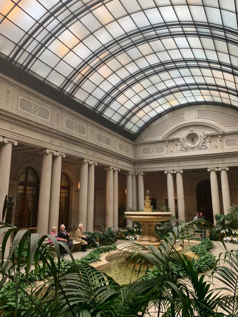
The Frick Collection holds over a thousand works. On display at any time: a few hundred, carefully selected, deliberately arranged to tell a story. Your website is the same.
You don’t need to say everything. You need to say the right things, in the right order, to the right person.
What is the one thing you most want someone to know when they arrive on your homepage? Lead with that. Curate ruthlessly. The rest can live deeper in your site, or not at all.
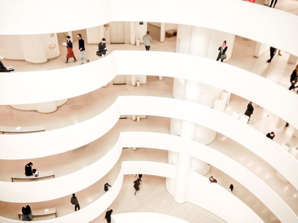
3. Wayfinding Is Invisible When It Works
You’ve never been to the Guggenheim and thought “wow, great wayfinding.” You’ve just… moved through it. Up the ramp, around the spiral, from work to work, without getting lost or confused.
That’s the goal. Navigation that requires no conscious effort.
Your website navigation should be so clear that no one has to think about it. Five menu items, maximum. Labels that say exactly what they mean. A path from “I just found this” to “I want to work with you” that’s obvious at every step.
When visitors have to hunt for things, they leave. Not because they’re impatient — because they’ve been given a reason to doubt you.
4. The First Room Sets the Tone
Every great gallery has an intentional entry experience. The Met’s Great Hall. The Guggenheim’s rotunda. These spaces don’t just orient you spatially — they tell you what kind of place this is before you’ve seen a single painting.
Your website hero section is your Great Hall.
It has roughly seven seconds to communicate: who you are, who this is for, and why it matters. That’s not much time. Every word, image, and design choice in that first section needs to earn its place.
Most wellness coach hero sections fail at this not because they’re ugly — but because they’re vague. “Helping you live your best life” could mean anything. Be specific. Be bold. Be clear.
5. Lighting Changes Everything
Even the most extraordinary painting looks flat under bad lighting. Galleries spend enormous resources on getting light right — direction, temperature, intensity — because it’s what makes art come alive.
Your website’s equivalent is visual hierarchy and contrast.
The “lighting” on your site is what you make bold, what you make big, what you give colour, what you leave plain. It’s the difference between a page that guides the eye and one that dumps everything at equal volume.
Your most important message should be the most visually prominent. Your call to action should stand out relative to everything around it. If everything is the same visual weight, nothing stands out — and nothing gets acted on.
The Museums That Got It Right (And What You Can Steal)
The Guggenheim built its entire architecture around the art experience — the famous spiral creates a continuous journey with no dead ends and no wrong turns. Apply it: your website flow should feel continuous, not like a collection of disconnected pages.
The Frick Collection uses intimate scale to create connection. Where the Met can overwhelm, the Frick invites. Apply it: consider whether your website is trying to be too much. Sometimes smaller, more focused, and more personal is the power move.
MoMA PS1 is deliberately unconventional — a repurposed school building where the architecture becomes part of the work. Apply it: your brand’s unique qualities aren’t a problem to polish away. They’re a feature. Lean in.
The Gallery Audit: Is Your Website Worth Staying In?
🖼️ Ask these questions about your website:
- Does your hero section clearly state who you help and how, within 7 seconds?
- Is there enough white space for your content to breathe?
- Can a first-time visitor navigate to your services or offers without thinking about it?
- Is every section of your homepage earning its place, or could you cut 30% and make it stronger?
- Does your visual hierarchy guide the eye, or does everything compete equally for attention?
The Bottom Line
Great galleries don’t succeed because they have the best art (though they might). They succeed because they’ve made it easy to experience that art — with space, intention, curation, and flow.
Your website is your gallery. Your clients are your visitors.
Give them a Great Hall that sets the tone. Give them walls that breathe. Give them a path so clear they don’t have to think about where to go next.
That’s not just good design. That’s respect for the people who showed up.
And it’s what separates the websites people stay in from the ones they leave before they’ve seen anything at all.