You’ve probably never thought of yourself as a Renaissance artist. But the most successful brand builders operating right now are doing exactly what da Vinci, Michelangelo, and Raphael did five hundred years ago. They’re studying human nature. They’re obsessing over proportion and light. And they’re creating work so intentional it feels timeless.
The Renaissance wasn’t just an art movement. It was a complete rebrand of what it meant to be human — and it has a lot to teach you about building a business that doesn’t fade with the next trend cycle.
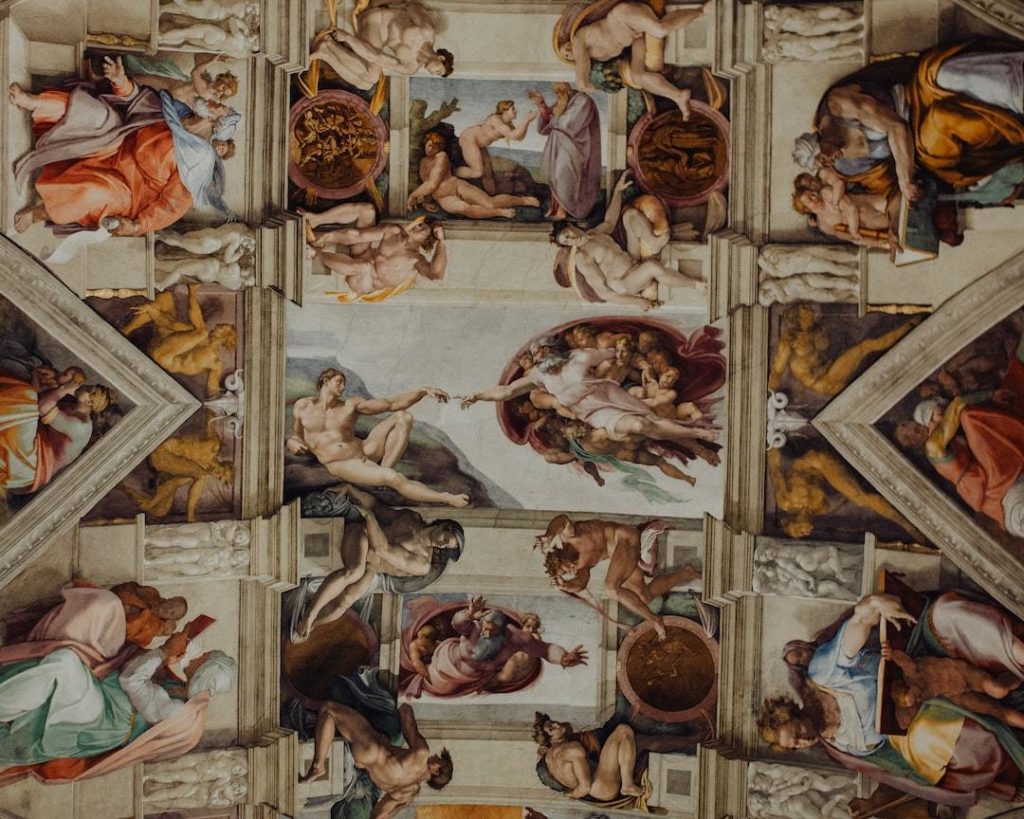
What Was the Renaissance, Really?
The Renaissance emerged in 14th-century Italy as a rejection of the rigid, rule-bound art of the medieval period. Artists and thinkers began looking back to ancient Greek and Roman ideals — harmony, proportion, and the celebration of human experience — and asking: what if we built something that actually felt like something?
The result was five hundred years of work that still stops people in their tracks.
That’s not a coincidence. It’s craft.
The Renaissance Principles That Secretly Run Great Branding
1. Proportion and Visual Harmony
Renaissance artists were obsessed with the golden ratio — a mathematical relationship that creates a sense of natural balance. It shows up in the Mona Lisa, in the dome of Florence Cathedral, in the arches of St Peter’s Basilica.
It also shows up in your brand — whether you’ve thought about it or not.
When your website feels “off” and you can’t explain why, it’s often a proportion problem. Your logo is too large. Your text blocks are too wide. Your images are fighting your copy for attention instead of supporting it.
Visual harmony isn’t a nice-to-have. It’s the difference between a website someone trusts and one they bounce from in seven seconds.
2. Light, Shadow, and Contrast
Renaissance painters pioneered chiaroscuro — the technique of using light and shadow to create depth, dimension, and drama. Without contrast, a painting goes flat. Without contrast, so does your brand.
This is why your sage green on warm off-white might look beautiful on your mood board and unreadable on your website. Contrast isn’t just aesthetic — it’s how people read, navigate, and trust your content.
A brand that plays it safe with low contrast doesn’t feel luxurious or minimal. It feels like it has something to hide.
3. Humanism: Putting the Person at the Centre
The Renaissance fundamentally shifted art from the divine to the human. For the first time, paintings depicted real people with real emotions — not icons, not symbols, but individuals.
This is exactly what your brand copy needs to do.
Most wellness coach websites talk at their client. Renaissance-level branding talks to them — with specificity, empathy, and the kind of emotional recognition that makes someone feel like you wrote the page just for them.
Your homepage isn’t a credential list. It’s a portrait of your ideal client, and how you help them.
4. The Long Game: Building for Legacy
The Renaissance produced work that’s lasted over five hundred years. It did this because the artists weren’t building for the moment — they were building with intention, with craft, and with a deep understanding of what they were trying to communicate.
Trend-chasing is the opposite of this.
Your brand doesn’t need to look like what everyone else in the wellness space is doing right now. It needs to look like you — clearly, confidently, consistently. That’s what creates recognition over time. That’s what makes someone say “I knew it was you” before they even read your name.
The Renaissance Lesson for Your Brand
Here’s what the Renaissance artists understood that most creative entrepreneurs miss:
Timelessness is intentional.
It doesn’t happen by accident. It happens when you choose harmony over chaos, contrast over mud, and human connection over performance.
You don’t need to be a painter. You don’t need to understand the golden ratio at a technical level. You just need to build your brand like it’s meant to last.
Quick Renaissance Audit for Your Website
| Renaissance Principle | Brand Question to Ask |
|---|---|
| Proportion & Harmony | Does your layout feel balanced, or are elements competing for attention? |
| Contrast & Legibility | Can someone read your website text without squinting? |
| Humanism | Does your copy speak directly to your client, or about your credentials? |
| Intentionality | Is every element on your site there for a reason? |
The Bottom Line
The Renaissance didn’t happen because a bunch of artists decided to get trendy. It happened because they committed to craft — to the idea that how something looks is inseparable from what it means.
Your brand deserves that same commitment.
Not because you need to be famous. Because the people you’re here to help deserve to find you, trust you, and feel like you understand them — from the moment they land on your page.
That’s what great design does. Five hundred years later, that hasn’t changed.