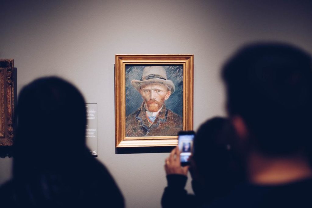
In 1874, a group of French painters put their work in a show and the art world laughed at them.
The paintings were too loose. Too sketchy. Too feeling and not enough finishing. One critic used the word “impressionism” as an insult — naming their style after Monet’s Impression, Sunrise to mock how unfinished it looked.
A hundred and fifty years later, Impressionist paintings are among the most recognised, beloved, and valuable art in existence.
The critics were wrong. The feeling was right.
Here’s why that matters for your brand.
What Impressionism Actually Was
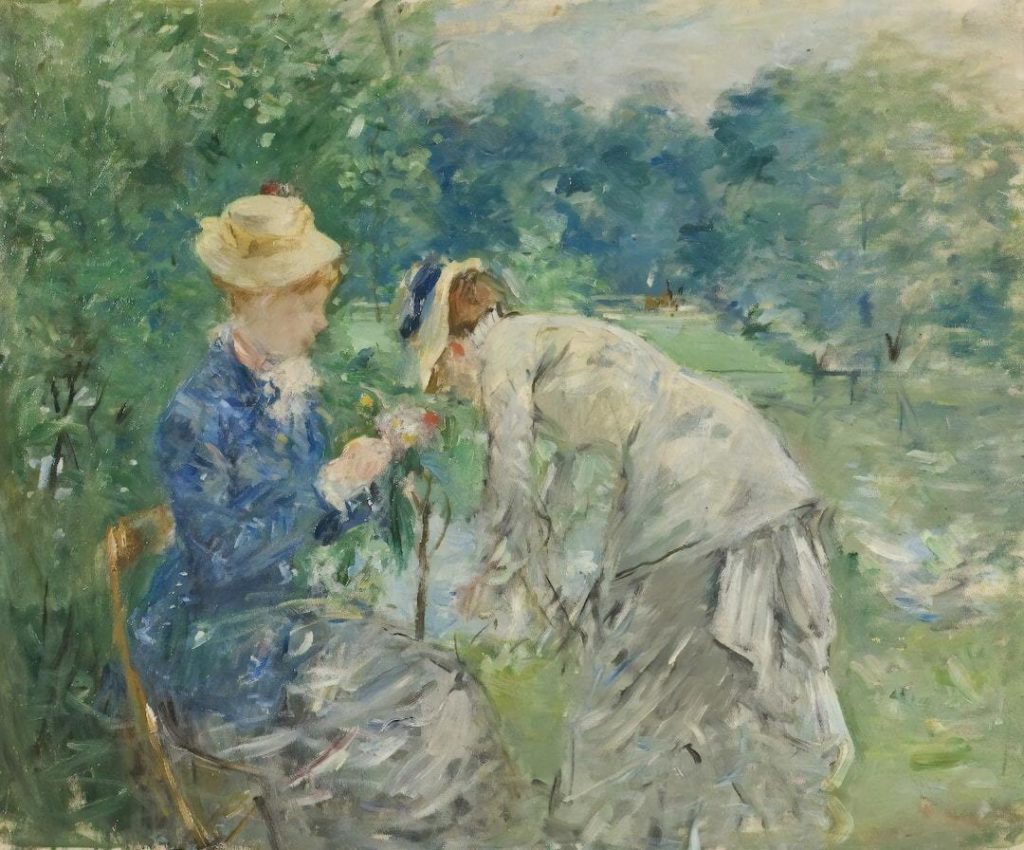
Impressionism was a rejection of the polished, controlled, hyper-realistic painting that dominated the French art world in the 1800s. Where traditional painters spent months smoothing out every brushstroke, the Impressionists went outside, painted in natural light, and tried to capture moments — the shimmer of water, the warmth of afternoon sun, the blur of a crowd.
The result wasn’t technically “perfect.” It was emotionally true.
Monet. Renoir. Degas. Cézanne. These artists understood something that took the rest of the world decades to catch up to: the goal of visual art isn’t to replicate reality. It’s to create a feeling.
And that’s exactly what your brand colours need to do.
The Impressionist Guide to Brand Colour
Colour Is Emotional, Not Decorative
The Impressionists didn’t choose colours because they were accurate. They chose them because of what they communicated. The way Monet rendered the same haystack in winter light versus summer warmth — that’s not just observation. That’s emotional intention.
When you’re choosing your brand palette, the question isn’t “does this colour look nice?” The question is: what does this colour make someone feel?
Soft sage green says calm, nature, grounded. Deep navy says trust, expertise, authority. Warm terracotta says energy, earthiness, accessibility. Pale blush says softness, femininity, approachability.
None of these are right or wrong. But they need to match what you’re actually promising your client — or there’s a disconnect before you’ve said a word.
Mood Over Accuracy
One of the most important Impressionist insights: the mood of a scene matters more than the literal colours within it. A sunset isn’t orange and pink because that’s what sunsets technically are. It’s orange and pink because that’s what a sunset feels like.
Your brand doesn’t need to be accurate to your industry’s expectations. It needs to be accurate to your positioning.
If you’re the wellness coach who helps burned-out professionals slow down, your brand probably shouldn’t feel like a high-energy gym. If you’re the coach who challenges clients to take bold action, your brand probably shouldn’t whisper.
Colour is one of the fastest ways you communicate positioning — before someone reads a single word.
Contrast Creates Vitality
The Impressionists were masters of placing complementary colours next to each other — not blended, but adjacent — to create a vibration, an energy, a sense of light that mixed pigments couldn’t produce.
Your brand needs the same kind of intentional contrast.
Not every element should be the same visual weight. Not every colour should sit quietly. Your call-to-action button should contrast. Your headline should demand attention. Your accent colour should do something when it appears — not just repeat itself everywhere until it becomes wallpaper.
Strategic contrast is what makes a design feel alive.
Authenticity Over Perfection
Impressionist paintings feel human. You can see the brushstrokes. You can sense the speed of observation, the artist’s presence in the work.
This is something a lot of wellness brands get wrong: in trying to look polished, they sand off everything that made them interesting.
Your brand can have refinement and personality. Your photos can be beautiful and feel like you. Your copy can be professional and sound like a real person talking.
The Impressionists didn’t become iconic because they were technically perfect. They became iconic because they were real.
Translating Impressionism to Your Brand Palette
| Impressionist Principle | Brand Colour Application |
|---|---|
| Colour creates emotion | Choose palette colours based on how you want clients to feel, not just what looks nice |
| Mood over accuracy | Let your brand feel like your positioning, not your industry’s default aesthetic |
| Complementary contrast | Use a strategic accent colour to make key elements pop |
| Authenticity over perfection | Let your brand have personality — don’t smooth it all away |
The Artists Who Faced Rejection (And Won)
Monet was rejected from the official Paris Salon multiple times. Renoir was told his work was sloppy. Cézanne was publicly mocked for decades.
They kept going. Not because the critics were encouraging, but because they understood something the critics didn’t yet: a new way of seeing takes time to catch on.
If your brand looks different from everyone else in the wellness space — if it has more edge, more colour, more something — that’s not a problem to fix. That’s a distinction to lean into.
The brands that look exactly like each other are fighting for the same clients. The brands that look distinctly like themselves are building something no one can copy.
The Bottom Line
Impressionism taught the world that emotional truth is more powerful than technical perfection. That feeling matters more than finishing. That a moment of light, rendered with intention, can move someone a hundred and fifty years later.
Your brand palette has that same potential.
Not because it needs to be a masterpiece. Because it needs to be yours — chosen with intention, built for emotion, and confident enough to be different.
That’s what the Impressionists understood. And it’s what separates the brands people remember from the ones that blur together into beige.