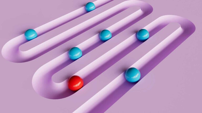
You don’t need a design degree to make beautiful things. But you do need to understand the rules — because knowing them is what separates a brand that looks polished and professional from one that feels a little… off, even if you can’t explain why.
The 7 principles of design are the foundational guidelines that designers use to make intentional visual decisions. Think of them as the grammar of visual communication. Once you know them, you’ll start seeing them everywhere — in the brands you admire, the websites that convert, and the Pinterest pins that stop your scroll.
This guide breaks each principle down in plain language, with examples that are directly relevant to creative online business owners — Etsy sellers, bloggers, coaches, and digital product creators.

Why Design Principles Matter for Your Business
Here’s the honest truth: most of your potential customers will make a split-second judgement about your brand before they read a single word. That first impression is based almost entirely on how your brand looks.
Design principles are the invisible framework behind that impression. When they’re applied well, your brand feels trustworthy, cohesive, and worth paying for. When they’re ignored, something feels “off” — even if your audience can’t articulate why — and they scroll past.
The good news is that you don’t need to consciously apply all 7 principles to every design. Once you understand them, they become instinctive. Let’s dig in.
The 7 Principles of Design
1. Emphasis — What Do You Want People to Notice First?
Emphasis is about creating a focal point — the one thing you want your viewer’s eye to land on first. Every good design has a clear hierarchy: most important thing, then second most important, then supporting details.
In practice for creative business owners:
- On your Etsy listing, emphasis should land on your product — not the background, not the watermark, not a busy border
- On a Pinterest pin, emphasis goes on the headline or the most compelling visual — make it big, bold, and impossible to miss
- On your website homepage, your headline and primary call-to-action should have the most visual weight on the page
How to create emphasis: size (bigger = more important), colour (bright or contrasting colours draw the eye), placement (centre or top of a composition reads as more important), and contrast with surrounding elements.
💡 Bowerist tip: A common mistake is trying to emphasise everything. If everything is bold, nothing is bold. Pick one focal point per design and let everything else support it.
2. Balance — Does Your Design Feel Stable?
Balance refers to the visual “weight” of elements in a composition. A well-balanced design feels stable and intentional. An unbalanced one feels like something is about to fall off the page.
There are two types:
- Symmetrical balance — mirror-image layouts that feel formal, ordered, and trustworthy (great for professional service brands)
- Asymmetrical balance — different elements that balance each other through contrast in size, colour, or placement (great for creative, editorial, and personality-driven brands)
In practice for creative business owners:
- A blog header with a large image on one side balanced by a headline and subtext on the other is asymmetrical balance done well
- An Etsy shop banner with equal visual weight on both sides feels grounded and professional
- A social media graphic that places a bold heading in the upper left and a supporting image in the lower right uses asymmetrical balance to create visual interest
3. Contrast — Does Your Design Have Impact?
Contrast is the difference between elements — light vs dark, large vs small, bold vs light, busy vs simple. It’s what gives your design punch. Without contrast, everything blurs together and nothing stands out.
In practice for creative business owners:
- Text legibility is the most important application of contrast — dark text on a light background (or vice versa) is always more readable than low-contrast combinations like grey text on white
- Colour contrast on your Etsy listings or Pinterest graphics determines whether your text can actually be read on a small screen
- Brand contrast — pairing a bold display font with a simple body font creates visual interest and hierarchy without needing any other design changes
A quick test: If you squint at your design and can’t tell where to look, you probably need more contrast.
4. Repetition — Does Your Brand Feel Consistent?
Repetition is what makes a brand rather than a collection of random graphics. When you repeat the same colours, fonts, shapes, and visual elements across everything you create, your audience starts to recognise your work at a glance — even before they see your name.
In practice for creative business owners:
- Using the same 3–5 brand colours across your website, social media, Etsy shop, and email newsletter creates instant recognition
- Consistent fonts — one for headings, one for body text — applied to every piece of content you create builds a visual signature
- Repeated design elements (a specific line style, icon set, texture, or shape) give your brand a distinctive look that’s hard to copy
- Canva brand kits are a practical tool for enforcing repetition across all your designs without having to remember every detail
💡 Bowerist tip: Repetition is the single most underrated principle for small online businesses. You don’t need a huge budget to look professional — you just need to be consistent.
5. Proportion — Are the Sizes Right?
Proportion (sometimes called scale) is about the size relationship between elements. Getting proportion right creates visual hierarchy — it signals to your reader what’s most important, what’s secondary, and what’s supporting detail.
In practice for creative business owners:
- A blog post heading should be noticeably larger than body text — not just slightly bigger, but meaningfully larger so the hierarchy is clear
- On a Pinterest pin, your headline text should be large enough to read as a thumbnail (roughly 1/3 of the pin height is a good rule of thumb)
- Product mockup photos use proportion deliberately — showing your product larger than its surroundings makes it the hero of the image
- Logo sizing matters — a logo that’s too large dominates everything; one that’s too small disappears
When in doubt, push your sizes further apart. The difference between H1 and body text should feel almost exaggerated — that’s usually about right.
6. Movement — Where Does the Eye Travel?
Movement in design isn’t about animation — it’s about how your eye travels through a static composition. Good design leads the viewer on a deliberate visual journey from the most important element to the next, and then the next.
In practice for creative business owners:
- A well-designed landing page uses visual cues (arrows, directional photos, diagonal lines, progressive sizing) to guide visitors from the headline → benefit → call-to-action
- Pinterest pins that use a top-to-bottom reading flow (headline at top, supporting image in the middle, URL or CTA at the bottom) naturally guide the eye through the content
- Diagonal compositions feel dynamic and energetic — great for promotional graphics and product launches
- Horizontal lines feel stable and restful — better for editorial content and brand storytelling
Ask yourself: When someone looks at this design, where do their eyes go first? Second? Last? Is that the order you intended?
7. White Space — Give Your Design Room to Breathe
White space (also called negative space) is the empty area around and between design elements. It might feel like wasted space — especially when you’re tempted to fill every inch with information. But white space is one of the most powerful tools in design.
More white space = more premium. Look at luxury brands, high-end magazines, and Apple’s marketing. They use less — less text, less clutter, more breathing room — and it signals quality and confidence.
In practice for creative business owners:
- Padding around text on graphics makes it dramatically more readable — even 20% more breathing room makes a huge difference
- Product photography with a clean, minimal background uses white space to make your product the absolute focus
- Website layouts with generous spacing between sections feel modern and trustworthy; cramped layouts feel cheap
- Email newsletters with clear spacing between sections are significantly more likely to be read all the way through
💡 Bowerist tip: If your designs feel amateur or cluttered, removing elements (rather than adding more) is almost always the fix. Resist the urge to fill every corner.
How to Apply These Principles Without Being a Designer
You don’t need to consciously run through a checklist of all 7 principles every time you design something. Instead, use this quick self-audit whenever something feels “off”:
- Is there a clear focal point? (Emphasis)
- Does it feel stable, or like something is falling off the edge? (Balance)
- Can I read all the text easily? (Contrast)
- Does this look like it belongs with the rest of my brand? (Repetition)
- Is the most important thing the biggest/boldest? (Proportion)
- Do my eyes know where to go? (Movement)
- Is there enough breathing room? (White Space)
If you can answer yes to all 7, your design is almost certainly working. If one stands out as a “no,” start there.
Conclusion
Design principles aren’t rules to follow rigidly — they’re tools to help you communicate more clearly and confidently. The more you practise applying them, the more instinctive good design becomes.
For creative business owners, the payoff is real: better-looking content gets more clicks, more saves, more shares, and ultimately more sales. You don’t need to be a designer. You just need to understand how design works.
Ready to level up your visual brand? Explore the Bowerist blog for more practical design and branding guides for creative entrepreneurs.