Color psychology is one of those things that sounds like a designer’s secret — but it’s actually shaping how people feel about your brand every single time they see it. Whether you realise it or not, the colors you choose for your website, content, and visual identity are communicating something before a single word is read.
For wellness coaches, creative entrepreneurs, and anyone building a brand online, color psychology isn’t just interesting theory. It’s one of the most practical and accessible tools you have — and understanding it can make a real difference to how your brand lands.

How Color Shapes Our Perceptions and Behaviors
While color perception has some personal and cultural variation, many associations are deeply ingrained — rooted in biology, shared experience, and learned meaning. This is what makes color psychology so powerful for brand-builders.
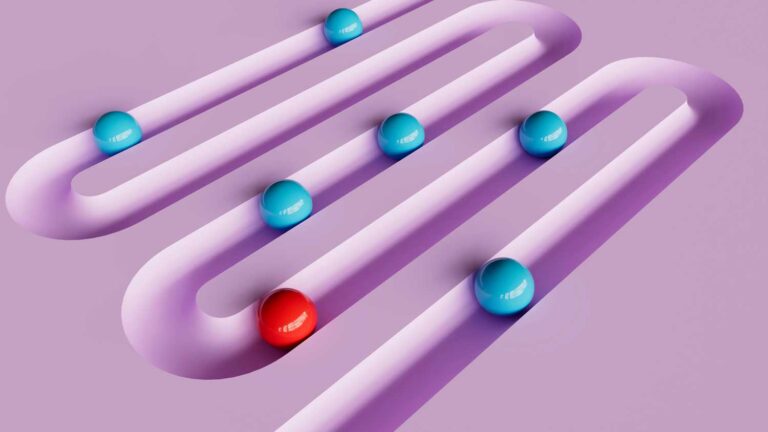
Red is almost universally linked to energy, urgency, and excitement. It triggers a physiological response — raised heart rate, heightened alertness — which is why it’s used on stop signs, fire alarms, and “buy now” buttons. Blue consistently conveys calm, trust, and reliability, which is why financial and healthcare brands lean on it so heavily. Orange carries warmth and enthusiasm; green signals growth, health, and prosperity.
These aren’t arbitrary associations. They’re built up over lifetimes — which means when you choose a color for your brand, you’re tapping into something much deeper than aesthetics.
💡 Bowerist tip: Most wellness and coaching brands default to soft greens, dusty pinks, and warm neutrals — because those colours do signal calm, care, and approachability. That’s not wrong. But it also means everyone looks the same. If you want to stand out in a crowded niche, use colour psychology intentionally rather than just following the aesthetic trend.
Color Psychology in Branding
For anyone building a brand — creative business, content platform, or coaching practice — understanding color is essential. The data makes a compelling case:
- 90% of customers make product decisions based on color alone
- 85% of shoppers admit color heavily influences their purchasing decisions
- In a 2019 study, 78% of participants remembered a brand’s color before its name
That last one is worth sitting with. People remember how your brand looks — especially its color — before they remember what you’re called.
Think about Nike using black to project power and sophistication. Or Apple’s clean white and grey palette that signals simplicity and innovation. These aren’t accidents. They’re deliberate choices made with the psychology of the audience in mind.
What This Means for Your Brand
Before you choose a color palette, ask yourself: What do I want people to feel when they encounter my brand? Energised and motivated? Calm and trusted? Creative and bold?
Your answer should guide your color choices — not just your personal preferences.
The Role of Culture in Color Psychology
One important nuance: color meaning isn’t always universal. Cultural context changes things significantly.
White represents purity and new beginnings in Western culture — but signifies mourning in many Asian cultures. Red signals luck and celebration in Chinese culture, while in Western contexts it often means danger or urgency.
If you’re building a brand with a global audience, this matters. Do the research before committing to a palette. What feels right in one cultural context might communicate something completely different in another.
Leveraging Color Psychology for Your Brand
Now for the practical part.
A Quick Guide to Color Associations
- Red — urgency, passion, energy. Great for CTAs, flash sales, and bold statement brands
- Blue — trust, calm, reliability. Works well for services, health, finance, and professional brands
- Orange — warmth, creativity, enthusiasm. Perfect for lifestyle, coaching, and education brands
- Green — growth, nature, health, prosperity. Popular in wellness, eco, and mindfulness niches
- Yellow — optimism, clarity, joy. Attention-grabbing without the aggression of red
- Purple — luxury, wisdom, creativity. Used by premium wellness and spiritual brands
- Black — sophistication, power, minimalism. Strong for high-end, fashion, and editorial brands
- Warm neutrals (cream, terracotta, sand) — approachable, earthy, trustworthy. Hugely popular in wellness and lifestyle brands right now
🌸 Looking for wellness brand palette inspiration? Peachy Zen is a great example of how self-care and journaling brands use soft, earthy tones to create an approachable, trust-building aesthetic.
💡 Bowerist tip: If you’re a wellness coach building your brand, you’re likely choosing from a well-worn palette — sage, blush, cream. Those colours do work, but consider adding one unexpected accent colour that’s distinctly yours. That’s the colour that makes your brand recognisable at a glance, even on a crowded Pinterest feed.
Build in Contrast and Consistency
A solid brand palette usually involves one or two dominant colors and a contrasting accent used sparingly for calls to action. The contrast helps important elements stand out — research found that a contrasting CTA button colour outperformed a matching one by 21% simply because it was more visible against the page.
Consistency is equally important. When you apply your palette the same way across your website, social profiles, email newsletters, and content — your brand becomes visually recognisable even without your name attached. People start to feel your brand before they consciously register it.
💡 Bowerist tip: Build your palette into a simple brand kit — your hex codes, your primary and secondary colours, and your accent. Save it somewhere accessible (a pinned Canva project works perfectly) so you’re never guessing your brand colours and accidentally using slightly different shades every time.
Test, Observe, Adapt
Color psychology gives you a strong starting point, but your specific audience and context always add nuance. Test different options where you can. Pay attention to what resonates, what gets clicked, what people remember.
The goal isn’t to follow rules rigidly — it’s to use color intentionally, in service of how you want your brand to feel.
Conclusion
Color psychology isn’t just for big-budget brands with design teams. It’s for anyone who wants their brand to communicate clearly, connect emotionally, and be remembered.
Understanding the psychological weight of color — and applying it deliberately — is one of the most accessible and high-impact things a creative business owner can do. It doesn’t require a big redesign or a design degree. It just requires intention.
Start with the feeling you want to create. Let your colors carry that message.
Want to build a brand palette that actually works for your niche? Explore the Bowerist blog for more practical branding guides written for creative entrepreneurs and coaches.