A call-to-action (CTA) is one of the most important elements on any website or piece of content — yet it’s often the most overlooked. You can have beautiful design, compelling copy, and an offer people genuinely want. But if your CTA is vague, weak, or buried, visitors will leave without ever taking the next step.
For creative business owners and content creators, this matters. Your work speaks for itself — but it still needs a clear invitation. These call-to-action design tips will help you turn passive visitors into active leads, clients, and customers.

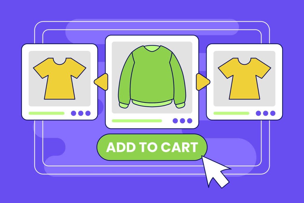
Why CTAs Matter for Creative Businesses
Think of your website as a gallery. You’ve curated the visuals, told your story, and showcased your work. But without a clear way to take action, most visitors will admire what they see — and move on.
That gap between I love this and I’d like to work with you or I want to buy this is bridged by a well-designed CTA. It removes the guesswork. It tells people exactly what to do next — and why it’s worth doing.
Without it, you’re leaving real connections and conversions on the table.
Clarity and Purpose: Tell People Exactly What Happens Next
The biggest CTA mistake is vagueness. “Click here” tells a visitor nothing. What will happen when they click? Where will they go? What’s in it for them?
Be specific and outcome-focused instead:
- ❌ “Click Here”
- ✅ “Download the Free Guide”
- ✅ “Book a Discovery Call”
- ✅ “Browse the Template Shop”
- ✅ “Start Building Your Brand Kit”
The best CTAs speak to the visitor’s intent and make the next step feel obvious. They answer why would I do this? before it’s even asked.
Visual Hierarchy: Make Your CTA Impossible to Miss
Good CTA design borrows from the same principles of visual hierarchy you’d apply in any creative work — composition, contrast, white space. These determine whether your CTA gets noticed or overlooked.
Contrasting colors: Your CTA button should stand out from your surrounding palette. A contrasting accent color on a calm background creates instant focus. HubSpot’s famous A/B test found a contrasting red CTA outperformed a matching green one by 21% — simply because it was more visible. To check whether your button color has enough contrast against your background, the free Bowerist Color Contrast Checker makes it easy.
White space: Give your CTA room to breathe. Framing it with negative space creates natural focus and signals importance.
Subtle interaction: A gentle hover effect or color shift makes a CTA feel interactive without being distracting. Use it sparingly.
The goal is to guide the eye naturally toward the action — not shout at the visitor.
The Power of Persuasive Language
The text inside your CTA button isn’t just labelling an action. It’s making a case for why someone should click. And small word changes make a significant difference.
Think about what your ideal customer is hoping for — not just what you want them to do — and write toward that:
- ❌ “Submit” → ✅ “Get My Free Strategy”
- ❌ “Learn More” → ✅ “See How It Works”
- ❌ “Sign Up” → ✅ “Join the Community”
- ❌ “Buy Now” → ✅ “Get Instant Access”
Personalisation takes this further. Research shows personalised CTAs lead to a 202% increase in conversions compared to generic ones. When you speak directly to what a visitor has been looking at or is likely to need, the invitation feels relevant — and more worth acting on.
Design for Mobile First
Most people will encounter your content and website on a phone. That means your CTA needs to work there first — not as an afterthought.
Practical considerations for mobile CTA design:
- Make buttons large enough to tap comfortably (44px minimum height is standard)
- Keep copy short — long labels get truncated or hard to read at small sizes
- Place the primary CTA high enough on the page that it’s visible without excessive scrolling
- Test the full click-through experience on your own phone regularly
Test, Observe, and Refine
No CTA strategy is set and forget. The only way to know what works for your audience is to test.
Run A/B tests on CTA copy, color, and placement. Track which versions get clicked. Adjust based on what you learn — not assumptions. Social media and email are low-friction places to test different approaches before committing to changes on your main site.
Over time, these small improvements compound into significantly better conversion rates.
The Bottom Line
A strong CTA isn’t a hard sell — it’s a helpful prompt. It’s the part of your design that respects the visitor’s time by making the next step obvious.
Apply the same intentionality to your CTAs that you bring to the rest of your creative work: think about the purpose, design for visibility, write for the audience, and refine over time.
That’s the difference between a website that gets admired and one that drives real action.
For a broader understanding of the design principles behind great CTAs, The 7 Essential Principles of Design covers the foundations. And if you want to understand why certain colors trigger action, Color Psychology: How Colors Shape Branding, Marketing & Buying Decisions is essential reading.
Ready to lock down your brand’s visual system so every CTA is on-brand? Start with How to Create a Brand Kit for Your Business.